
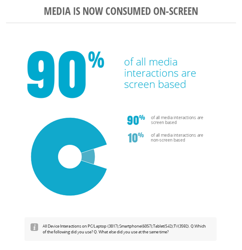
Ninety percent of all media interactions are screen based, and consumers use multiple screens to consume media, research products, and stay in contact with family and friends. Twenty-four percent of these interactions occur on a computer, 38% on a smart phone, and 9% on a tablet device. This is the multi-screen world we live in. For your site to be an effective tool that drives growth for your business whether you’re an online retailer or a local pizza shop, your site must be built to accommodate the new way users are consuming information. Every business should have a digital strategy! Within your strategy there should be some consideration for mobile devices. If you haven’t taken the step to develop that strategy, it is never too late. The only thing you lose by procrastinating is potential customers. Most business owners realize they need a website Most have commissioned one to be created or have attempted to create one from a template themselves without first considering anything more than the fact they need a website. This is a bad way to approach your digital strategy. In order for you to maximize your investment in a digital representation of your business, you must first decide what your goals are for the site. Some questions to consider: Who is your customer? How will your customer be consuming the content on your site? How will that customer find your site? Why will they come to your site? Once they are at your site, what would you like them to do? How do you intend to achieve the goals that you have set for your site? Do you want to sell products or services through the site? Answering these questions will help you develop the content for your site. Once you have decided what you want to get out of your investment, you can move into developing the strategy and launching it.
Responsive Design: There are a lot of companies and websites throwing around the term responsive design, this is becoming a misnomer. What some are calling responsive design is actually building two separate sites for the same business – meaning that the end user has a completely different experience on their mobile device than they do on a desktop. If you have found content on a website when using your pc and later attempted to locate the same content on your mobile device only to fail, then you know how frustrating this strategy is for the end user. Furthermore it’s not responsive design, and Google will penalize your search rank for it. The correct way to create responsive design is to develop a site that has the same content and navigation regardless of the device being used. When a site is created with the correct type of code and design style, a user will be able to access and easily locate the identical content on your site regardless of the device they are using.
Responsive Design & SEO – The reason not doing this affects your search rank is because Google wants to ensure a good user experience regardless of device which means easy navigation and easily-located content. If you are unsure whether or not your site is built in a responsive design, just try to access it on a desktop and then with a mobile device. The site should adjust itself to fill the screen of the device you are utilizing. If you’re using a phone to check, another good technique is to pull up your site in portrait mode, and then turn your phone into landscape mode and see if the site adjusts to fill the screen. A good example of responsive design is www.SkinRenewalOfTulsa.com. If you have any questions or are unsure about your site, contact us at sales@SkyNet-Solutions.net Custom Data Board Infographic for SkyNet Solutions The graphs and charts shown on this site are a part of Google’s Databoard for Research Insights. Come explore the studies, then share them with others and create your own custom infographics. Visit the Databoard By: Joe Hart Source: SkyNet Solutions