Categories
Development

Is Your Website Design Important?

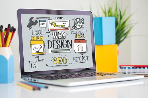
When you look at your competitor’s websites, you may start to think the design of your website has become a little dated. While you may not feel like the current design of your old website is affecting your sales, studies have shown that having a modern web design can generate new business and results in more conversions. Here are some of the important factors you should look at to determine whether you need to improve your website design.

Consistency Across Mediums

Do you promote your business through social media? (If not, you should!) When you look at your website and compare it to your social media platforms, it is important to maintain consistency across mediums. This ensures that your customers can recognize your brand across different platforms. Everything you do online is important and interconnected, making consistency key for growing your business online.

Effective Navigation

The navigation menu of your website is arguably its most important component. If visitors aren’t able to easily find the information they are looking for, they likely won’t stick around or continue to visit your website. Ensure your website has a navigation bar on every page that provides easy navigation to the various pages available on your website. Simplified navigation options and a responsive web design, can ensure that everyone has the ability to properly find their way around the information, products or services that are available through your website.

Content and SEO Considerations

The importance of the content on your website is often misunderstood by many business owners. The content written and used for your website, or SEO,  has a direct correlation with the placement of your business on search engine results pages. If your existing website content was written without strategically placing keyword phrases you want to rank for in it, it may be time to for a website redesign.

Do You Need a New Website Design?

Skynet Solutions is committed to providing the best web design services for Tulsa and all of Oklahoma. If you are ready to expand your web presence, redesign your existing website or enhance your digital marketing, we are here to help. You can fill out our contact form to get started today. You can also connect with us on FacebookTwitterGoogle+ and LinkedIn!

Categories
Development

Responsive Web Design – What is it and Why Does it Matter?

If you browse the internet from a variety of devices and device sizes, you have likely come across websites that are virtually unusable on a mobile platform. With the growing importance of mobile internet, it is important to create a website version that is mobile-friendly and provides a great user experience. To help combat this growing problem and ensure a seamless user experience across devices, our Tulsa website design firm utilizes responsive web design for all websites we build for customers.

What is Responsive Web Design?

Responsive web design focuses on the belief that both the website design and development should be able to adapt to the user’s behavior or device by taking metrics like screen size, screen orientation and individual browser or operating system into account. In a nutshell, this means that if a visitor to your website wanted to move from their computer to an alternative device like an iPad, the experience would be the same. To do this, a responsive web design includes the coding and technology necessary to detect the screen size and resolution, then adjust it accordingly without needing user input.

Why Does Responsive Web Design Matter?

In recent years, mobile web browsing has overtaken desktop web browsing as the proliferation of smartphones and tablet devices continues. In fact, according to Search Engine Land, nearly 60% of web searches now come from mobile devices. Doesn’t this insight alone warrant for investing in responsive web design to create a seamless experience for your website visitors across any devices they may have? Every business has a website to grow their business, primarily with search engine optimization strategies and digital marketing. According to Google, the top search engine and organic traffic referrer,  responsive web design is the industry standard and could have a direct impact on your search engine ranking. Having a single website that adjusts to the user’s device creates shareable content across multiple platforms from a single URL, something Google places incredible value on.

Is Your Current Website Responsive?

Skynet Solutions is committed to providing the best web design services for Tulsa and all of Oklahoma. If you are ready to expand your web presence, redesign your existing website or enhance your digital marketing, we are here to help. You can fill out our contact form to get started today. You can also connect with us on FacebookTwitterGoogle+ and LinkedIn!

Categories
Development

The Benefits of Custom Websites

The modern internet world is filled with free websites bearing countless iterations of templates. Though templates can serve a purpose and provide a quick entrance into the online medium, cookie cutter template websites aren’t as unique or useful as a custom website. When dealing with a personal website, the ability to manipulate the look and content attached to it should be a flexible, yet easy, process. Search Engine Optimization Generic free sites generally aren’t built to be SEO friendly. For this reason, individuals will find it is very unlikely the site will rise in search results. With a custom website, the entire spectrum of SEO can be utilized to make a website more visible and discoverable. Custom websites can help funnel potential customers to a target site to provide services or products they are searching for. Branding Custom websites can be tailor-made to mimic branding preferences and achieve a cohesive look between products or services offered by a company. This attention to detail will make a business seem more reputable and distinguished in the eyes of potential customers. A custom, professional website can create a positive first impression to generate sales. Tech Support  If a custom website is designed and hosted by a trustworthy firm, technical support is guaranteed to be included. This means business can focus on sales and not on the technical side of keeping a website functional. Content updates and expansion can always be a delicate procedure without ruining a website’s functionality, having a professional to implement it will save time and money in the future. If your business is in need of a professional, functional website, with the ease of use customers will appreciate, call us today or contact us through our online form! We would love to help build the custom website needed to grow your business.

Categories
Development

Google Skewing Search Results?

With the overall convenience of Google as a search engine, it’s easy for us to not worry about how it works and assume everything about it is working to help us. But a recent study published by the Yelp data science team and conducted by researchers at the Harvard Business School and Columbia Law School, reveals that there’s something fishy going on behind the scenes.

Click here to view the full research paper.

To put it succinctly, the research shows that Google often skews search results to display its own content before other, potentially more useful, results. The most obvious way this happens is through Google’s Local OneBox. This is the functionality that you often see on the right hand side when searching for something local. This usually gives you detailed information about a business and a link to its Google+/Google My Business page.

Because of this, businesses that have a Google+ page are almost always displayed first, even if they are less relevant to the search. This is why it’s always important to ensure that your web presence is being handled by someone who understands search engines and knows how to put your business on top. At Skynet, we specialize in SEO. Give us a call at 918-895-1982 and we’ll talk with you about how to make your business more visible on the web.

Paraphrased and summarized from this article: http://news360.com/article/300185046

Categories
Development

Post-Mobilgeddon – Did you survive?

“Mobilegeddon”, the mobile apocalypse, or so it was explained to us, is over. The Google algorithm update that pushed mobile-friendliness was rolled out on April 21st, so we’ve had a little over a month to see its effects. This update changed how the search engine evaluated and ranked various websites. Clearly Google wanted to improve a mobile users experience by increasing the visibility of mobile-friendly sites and decreasing the visibility of non-mobile-friendly sites. Many online communities heralded this update as the next big game-changer in the mobile world but the results seem to have been less than apocalyptic. Were you affected? Thankfully the aftermath of Mobilegeddon wasn’t quite as dramatic as some predicted it would be. While some websites reported minimal effects, very few, if any, have yet to reveal any catastrophic drop in their search rankings. The rollout was slow and after the first few days a handful of major sites were penalized, but they weren’t completely blown off the face of the Earth either. Instead, they dropped a bit in the search rankings while a few other sites correspondingly rose. All in all, not much shifted greatly. Did you survive? It wasn’t “The End.” This wasn’t the first time that a Google update announcement has caused a lot of unnecessary drama and it certainly won’t be the last. They just want users to have the best possible experience regardless of what type of device they’re using. Google will continue making regular updates and those will continue to vary in scale from the hardly noticeable to the truly game-changing. Looking ahead to future updates, take the appropriate precautionary measures, let the cards fall where they may, and you will survive, but also think of it as an opportunity to advance your business with a website that keeps up with modern developments and invest in mobile technology and mobile marketing strategies because they’re not going away any time soon. What’s next? At this point, if your website still isn’t mobile-friendly, it’s not actually the end of the world, but you may need to consider the ramifications of remaining unfriendly. If your website gains a lot of visitors from mobile devices, it may be worth it to invest in optimizing your site for those mobile customers to create a superior user experience. Inspiring mobile sites are ultimately a good thing for your business and a great thing for the Internet in general. Once you’ve tackled the development of a mobile-friendly site, then it’s time to start looking into some of Google’s latest enhancements: fact-checking and structured data. Contact the web experts from Skynet Solutions at 918-895-1982 for assistance in this new “mobile-friendly” world and we will help make sure your customers have the best experience possible.

Categories
Development

Is Your Website Prepared for Mobilegeddon?

The 21st of April is fast approaching! What’s being dubbed across the internet as Google’s “Mobilegeddon” isn’t just any old doomsday device or scare tactic. Ready or not, it’s coming!

Basically, if you don’t already have a mobile-friendly website then you’ll need one and sooner rather then later. Beginning on Tuesday, April 21st, Google will begin rolling out their search algorithm update which they say will have a significant impact on search results for mobile users. Ultimately, they just want to give mobile users the best online experience possible without all the small text, the long load times, the pinching and the grabbing.

In essence, if your website is not considered “mobile-friendly”, there is a real possibility that Google will start to send you fewer mobile search customers after their update. Typically, webmasters see about 30-50% of all traffic, across all client websites, come from mobile devices. And no one wants to see that kind of drop in the amount of customers visiting their site. For the past few years, Google has spent a lot of effort pushing everyone to go mobile. So if you haven’t made the leap to a mobile compatible site yet, this announcement should be your wake up call.

The date is set and the world wide web for mobile users and business owners alike is about to change, but it’s not going to be the end of the world as long as your website is prepared. The best way to ensure that you’re ready when the horsemen of the mobile-apocalypse arrive is to have a responsive website. This type of site only has one domain, rather then a separate one for desktop and mobile, and the design of a responsive website will reformat to fit the screen on which it is being viewed, regardless of whether it’s a desktop, laptop, tablet, or mobile device. Current statistics show that mobile-friendly sites have much better conversion rates. They tend to load faster then their desktop counterparts and their ease of navigability offers a better mobile user experience.

Preparedness of this measure, however, isn’t always a quick fix. Unfortunately, responsive websites take time to design, develop, implement, and test. Thankfully the knowledgeable professionals at Skynet Solutions will guide you through the process and help your business build a website that not only makes mobile users (and Google) happy but also maintains your ability to fit well into the future of ecommerce. For more information on how Skynet Solutions can help prepare your website for “Mobilegeddon”, contact us at 918-895-1982.